
01
Core of the engagement
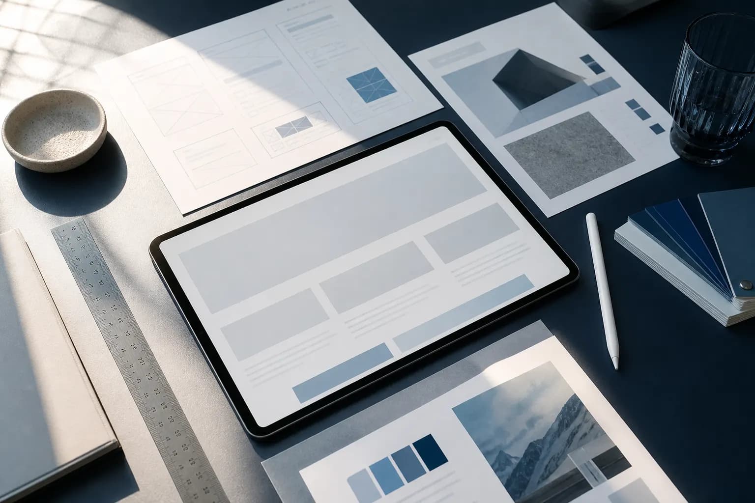
Custom design
Layouts and type systems that match your brand, not a theme demo.
Sites that look like your brand and convert like a landing page — bilingual where the market needs it, fast on mobile.

Client reviews
5.0
150+ reviews on Google & Clutch
24h
Reply time
Pipeline-tied
Reporting
Named lead
Ownership
“A site that finally feels like us.”
They spent the first two weeks understanding our buyers before showing a single screen. The new site converts noticeably better and our sales team actually sends people to it.
Lina Haddad
Brand Director, Haddad Interiors · Abu Dhabi
“A site that finally feels like us. They spent the first two weeks understanding our buyers before showing a single screen. The new site converts noticeably better and our sales team actually sends people to it.”
“Bilingual without breaking the layout. Arabic and English switch cleanly on every page. Our previous agency never managed that.”
“Fast on real mobile connections. Pages load quickly even on slower networks, and WhatsApp enquiries jumped after launch.”
“Organised, on time, no surprises. Clear milestones, a shared board, and they launched the week they said they would.”
“We finally rank for the terms that sell. They started with a technical audit instead of a content calendar, fixed what was blocking indexation, and only then wrote pages. Six months later our advisory pages sit in the top five and demo requests come from organic, not ads.”
“Spend finally knows where it’s going. Our Google Ads account was one big campaign burning budget on informational queries. They rebuilt it by intent and city, and our cost per lead dropped in the first month.”
“Calls from the right neighbourhoods. We show up in the map pack where our patients actually live, and the calls are higher quality. Our front desk noticed before our reports did.”
“We now show up in AI answers. When prospects ask ChatGPT or Google’s AI about our category, we’re cited. They fixed our entity data and structured content so machines understand what we do.”
“Creative that actually earns the click. Weekly creative tests and honest readouts. We stopped guessing which ads work — and orders more than doubled.”
“A feed with a point of view. Our social used to be stock photos and announcements. Now it sounds like us and people actually comment.”
“Pages worth ranking. They interview our experts and turn it into content our buyers actually read. Several articles now bring in leads every week.”
“Built to be crawled and fast to use. They rebuilt our platform on a modern stack. It’s faster, Google indexes it properly, and our team can update content without a developer.”
“An identity that holds under pressure. From the logo to the pitch deck, everything finally looks like one company. Investors noticed.”
“Product pages that close. They rebuilt our collection and product pages and fixed our feed. Conversion went up across every channel, not just one.”
What we do
Before type and colour, we write down the primary job. A brochure that tries to be a magazine, a careers hub, and a product catalogue at once usually fails all three. We pick one primary conversion and let the rest of the IA support it.
Then we map the paths: which pages a paid click should land on, where proof sits, and how someone who is not ready to talk still leaves a way back. Wireframes come before polish. If a template cannot explain the offer in a few seconds on a phone, visual finish will not save it.
Bilingual layout is a design constraint, not a toggle. Arabic and English need room, alignment, and a switch that does not break the grid. We plan for that from the first templates.
Interfaces people actually use.
150+ client reviews
Every engagement starts with your business objectives — not a set of tactics.
Decisions come from search data, conversion data, and market signals.
We optimise for enquiries and revenue — not vanity metrics.
Compounding results, continuous optimisation, and honest reporting.
Results
Measured against pipeline and revenue — reported monthly in plain language your team can act on.
What’s included
Each component has a clear purpose in the mix — the whole is a stack, not a package.
Core of the engagement
Layouts and type systems that match your brand, not a theme demo.
When the CMS needs to be familiar for your team, without looking like a template.
Uptime, updates, and performance so the design you paid for stays fast.
Colour, type, and components that can travel from the site into campaigns.
The pages paid traffic actually hits — structured for proof and a form, not a generic inner page.
Need a custom mix?
Tell us your goal — we’ll scope only what moves it.
Build my scopeWhy it matters
“A website is still where a paid click or a sales conversation ends up.”
If it is slow, unclear, or designed for a different country, you pay twice: once for the traffic, again in lost enquiries.
We design for how your buyers actually move — service pages, proof, and a form that does not feel like a chore. Visual language follows the same system as this site: calm, typographic, not a dark template with stock robots.
Surface-level redesigns swap colours and leave the information architecture intact. Real work decides the jobs of the site first — leads, hiring, product education — then designs templates that can do those jobs in two languages if the market requires it.
How we work
A clear sequence with a named owner at every step — so you always know what is happening this week, and why.
Phase 1
Leads, hiring, or product education — we design against one primary job first.
Phase 2
Information architecture and key templates before visual finish.
Phase 3
Development follows the design system. We do not invent components in the CMS that the design never specified.
Phase 4
Analytics and form quality in the first weeks, then iterate the pages that stall.
Why WB DIGITECH
Pretty is cheap. We start with the conversion the site has to earn, then design templates that can do that job on mobile, in the languages you actually use.
If campaigns and the site look like two agencies, trust leaks. Type, colour, and components are meant to travel.
If the service pages cannot explain what you sell, we say so. Motion and photography come after the copy is honest.
FAQ
Straight answers to what clients ask before they start. Anything else — ask us directly.
Talk to a strategist
A short call, no pitch deck. We’ll tell you honestly if we’re the right fit.
Often yes. If the CMS and URL structure are sound, we redesign templates rather than throwing away SEO equity.
Pairs well with

Web & brand
Web Development
Engineering behind the design — performance, CMS, integrations, and the unglamorous work that keeps a site fast.
Explore
Web & brand
Creative / Branding
Identity, collateral, and design systems that can travel from the website into campaigns without looking like two agencies.
Explore
More services
Conversion Rate Optimization
Turn more of the traffic you already have into enquiries — tests, not opinions, on the pages that stall.
ExploreTell us where you are and where you want to be. You’ll get a clear plan, scope, and timeline — not a sales pitch.